
#Tutorial: Hidden MusicPlayer 2
Saturday 21 May 2016 @ 02:54
大家好
这一款稍微不一样
这个教程是在fukuo那边拿来的哦
来看看吧
步骤
1.开你的模板
2.Ctrl+F(Command+F用Mac的)找</head>
3.在</head>之前放
#music-rounded {
position:fixed;
left:75px;
top:150px;
width:50px;
height:50px;
background-color:#000;
-moz-border-radius:100px;
-webkit-border-radius:100px;
border-radius:100px;
opacity:1;
-webkit-transition: all 0.4s ease;
-moz-transition: all 0.4s ease;
transition: all 0.4s ease;
}
#music-rounded img {
margin-top:17px;
margin-left:-2px;
}
#music-rounded:hover .music-player-embed {
-moz-border-radius:5px;
-webkit-border-radius:5px;
border-radius:5px;
margin-top:-20px;
opacity:1;
background-color:#000;
color:#fff;
-webkit-transition: all 0.7s ease;
-moz-transition: all 0.7s ease;
transition: all 0.7s ease;
}
.music-border {
position:absolute;
margin-top:-42px;
margin-left:-15px;
border:10px solid rgba(0, 0, 0, 0.4);
width:60px;
height:59px;
background-color:none;
-moz-border-radius:100px;
-webkit-border-radius:100px;
border-radius:100px;
-webkit-transition: all 0.4s ease;
-moz-transition: all 0.4s ease;
transition: all 0.4s ease;
}
.music-border:hover {
margin-top:-48px;
margin-left:-20px;
border:15px solid rgba(0, 0, 0, 0.4);
-webkit-transition: all 0.7s ease;
-moz-transition: all 0.7s ease;
transition: all 0.7s ease;
-webkit-transform:rotateY(360deg);
-moz-transform:rotateY(360deg);
-o-transform: rotateY(360deg);
}
.music-player-embed {
font-family:Consolas;
font-size:11px;
position:absolute;
min-width:100px;
background-color:#FFF;
padding:9px;
margin-left:90px;
margin-top:0px;
overflow:hidden;
opacity:0;
-webkit-transition: all 0.7s ease;
-moz-transition: all 0.7s ease;
transition: all 0.7s ease;
}
-size和颜色可以自行更换哦
4.Ctrl+F(Command+F用Mac的)找</body>
5.在</body>之前放
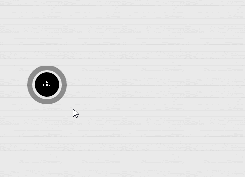
<div id="music-rounded">MUSIC PLAYER CODE HERE=放你的mp3在那里
<center><img src="http://66.media.tumblr.com/tumblr_m7w2py1dEP1r6o8v2.gif"></center>
<div class="music-border"></div>
<div class="music-player-embed">
<center>MUSIC PLAYER CODE HERE</center>
</div>
</div>
6.Save,成功的话就恭喜啦 ^-^
Labels: tutorial

 我是一个90后,双鱼座的孩子,喜欢一切美好事物,比如说看到家人朋友天天开心,看偶像导演的戏,看到花开花谢,看到自己收集的书,看到自己喜欢的口红,这些都会让我很开心很开心。我能很乐观也能很悲观,完全没有中立的可能。中学时期是是一个常常摆着一张脸的人。那时候的我超级喜欢打羽毛球,甚至去教练的课程打羽毛球打到自己有两块腹肌,全身肌肉很结实,可是现在都不如往日,时间越来越少,越来越忙碌,一年都没有打羽毛球一次,慢慢颓废了。
 拥有金鱼般的记忆力,很快忘记很多伤心的一切事物。我是一个会发呆上小时的人(我也不懂我在搞什么)。我喜欢很多颜色,要么很深要么很浅。喜欢寻求刺激,喜欢坐上过山车的感觉。喜欢到外国旅行,因为能脱离自己凡俗的生活。不知道为什么莫名其妙的,就是喜欢牡丹花和仙人掌,也喜欢红烈鸟和浣熊


